1

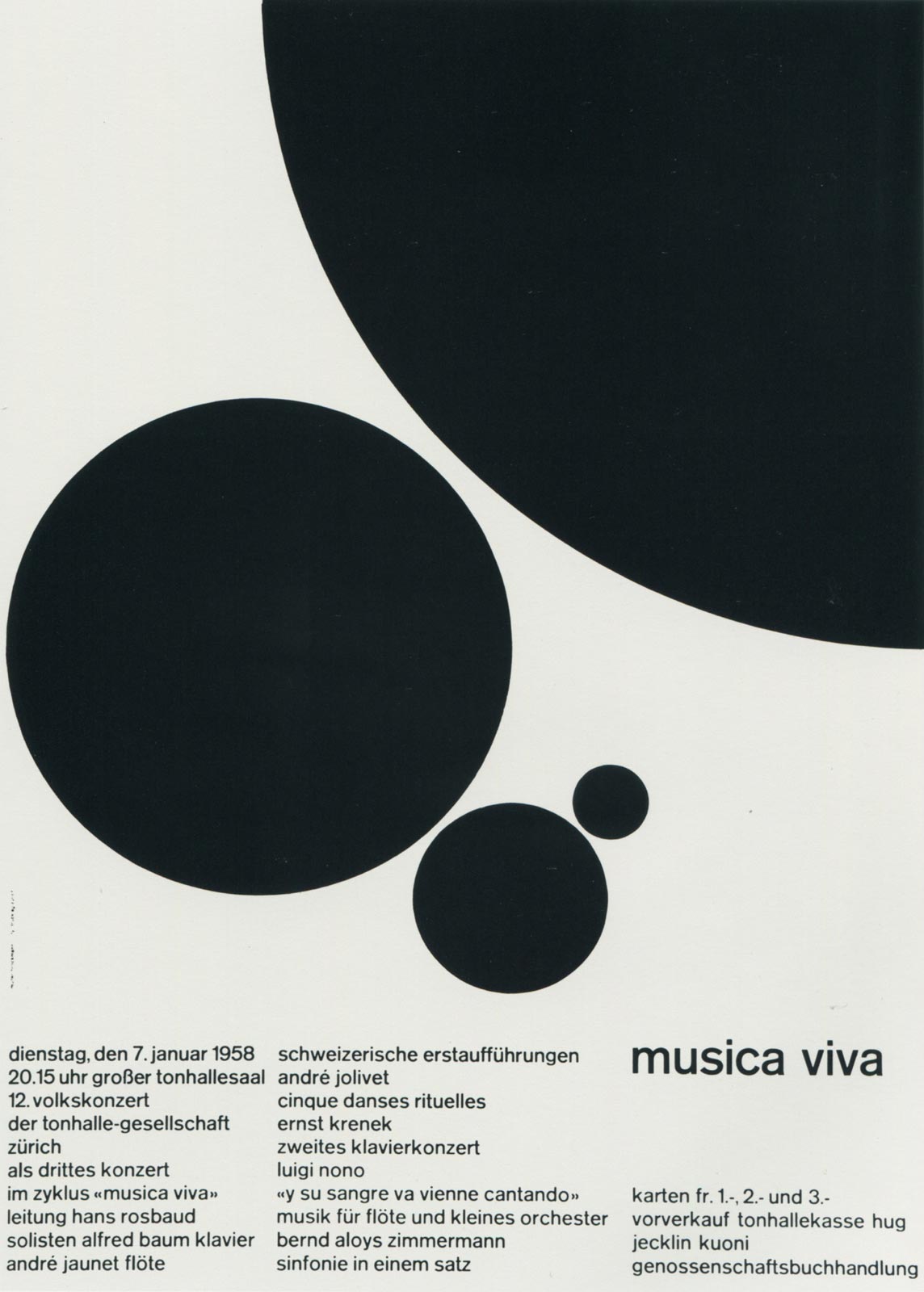
This poster only uses simplified grids with black and white colors. I am really attracted to this minimalism style. Most of the situation, the simpler the shapes are, the harder it can be made into a good-looking design. The designer behind this poster is called Joseph Muller. The most amazing part of this poster is the circles. They seem to be put randomly on the poster, but there is actually a principle applied on them. The biggest circle is only shown a quarter of it and all the circles are connected in 45 degrees. The small details actually help to form this great work.
2

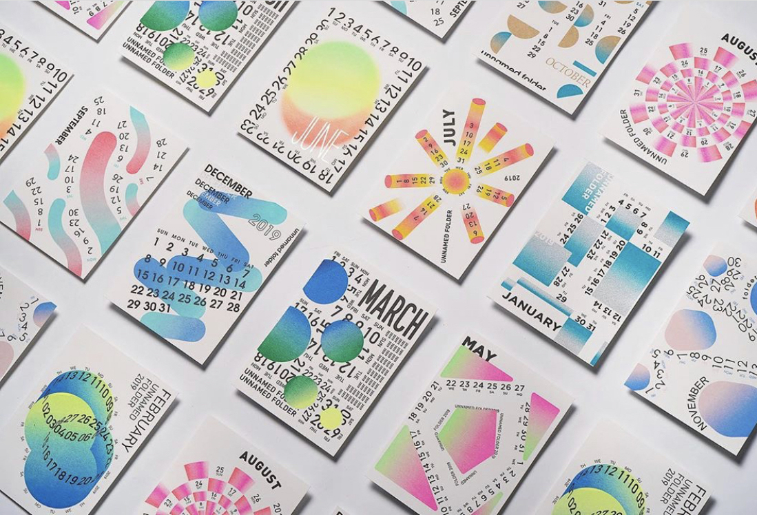
This design of calendar attracted my attention immediately after I saw it. The shapes combined with numbers brings a feeling of digital computing art. The use of gradient on white background is so pretty that creates illusion of dream. Most of them use organic shapes for the cover and create a similarity of watercolor, which uses gradient colors and creates a smooth feeling.

3

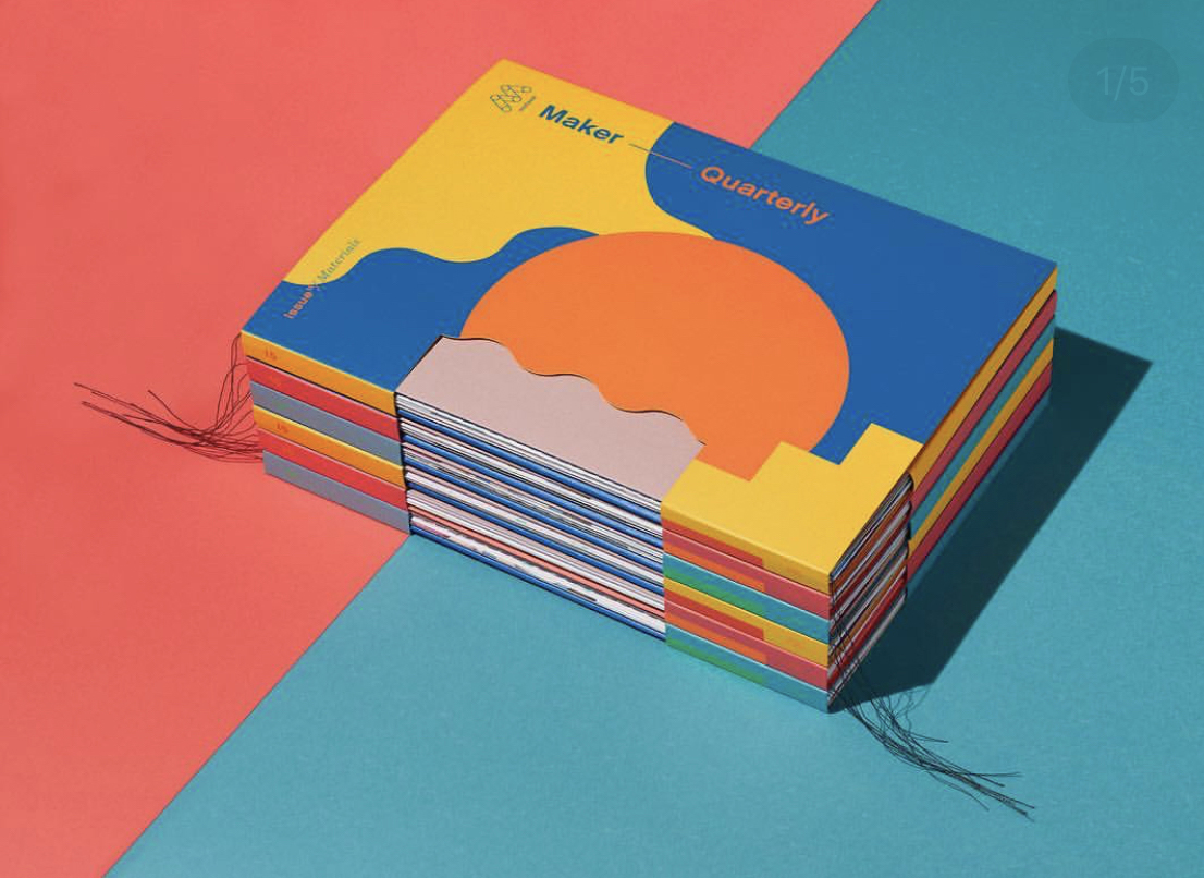
This is graphic designed book. The designer mainly uses primary colors to compose the whole book cover. The most interesting part of this book I think is the cut-out part of the cover. The curve shape really adds its specialty to the cover. The color choice of orange and blue is in contrast and brings visual impact to the audience.